Friday, April 30, 2010
Monday, April 26, 2010
Cocona corporate identity – a case study
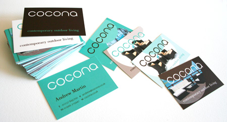
Earlier in the year I was working on a corporate identity for ‘Cocona’ a new St Albans-based business. The business sells cool, contemporary, outdoor, rattan furniture.
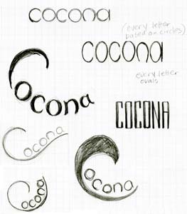
So I sketched out dozens of different logo options – these are just a few. Cocona is the name of a tropical fruit so there was a little detour around considering references to fruit and seeds. And whilst trying that option, I discovered that the letters of the company name happened to all be letters that could primarily be made from circles. So finally, a minimalist rendition of letters made of circles was the option that the business partners and I wanted to go for.
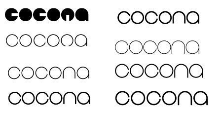
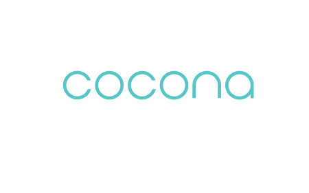
I fine-tuned the details of the shapes and thickness of the letters – whether the ends of the letters should be rounded or flat – and eventually we settled on this final logotype.
The palette of chocolate and turquoise having been chosen, the next challenge was how to produce printed publicity – in advance of receiving the furniture – using the low-resolution photographs supplied by the manufacturer. The solution I came up with, was to use moo business cards. The photographs were crisp – so long as they were reproduced at small business-card size. Moo uses variable print technology, which meant we could economically print up to 50 different images on one side of the business cards. Contact details were on one side, and on the reverse, where we could have innumerable options, we had about 20 different images of the products, together with a few type-only options.
So now the Cocona team can fan out their business cards and the full range of their furniture can be displayed.

If my garden and patio wasn’t littered with bikes and canoes, I’d be picking out some of this furniture for myself for the summer, because they have some gorgeous stuff.
So I sketched out dozens of different logo options – these are just a few. Cocona is the name of a tropical fruit so there was a little detour around considering references to fruit and seeds. And whilst trying that option, I discovered that the letters of the company name happened to all be letters that could primarily be made from circles. So finally, a minimalist rendition of letters made of circles was the option that the business partners and I wanted to go for.
I fine-tuned the details of the shapes and thickness of the letters – whether the ends of the letters should be rounded or flat – and eventually we settled on this final logotype.
The palette of chocolate and turquoise having been chosen, the next challenge was how to produce printed publicity – in advance of receiving the furniture – using the low-resolution photographs supplied by the manufacturer. The solution I came up with, was to use moo business cards. The photographs were crisp – so long as they were reproduced at small business-card size. Moo uses variable print technology, which meant we could economically print up to 50 different images on one side of the business cards. Contact details were on one side, and on the reverse, where we could have innumerable options, we had about 20 different images of the products, together with a few type-only options.
So now the Cocona team can fan out their business cards and the full range of their furniture can be displayed.

If my garden and patio wasn’t littered with bikes and canoes, I’d be picking out some of this furniture for myself for the summer, because they have some gorgeous stuff.
Saturday, April 24, 2010
Sunday, April 18, 2010
Wednesday, April 14, 2010
Turkish café – Green Lanes
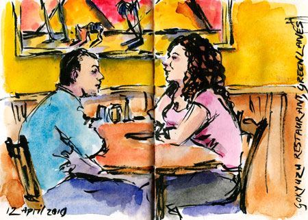
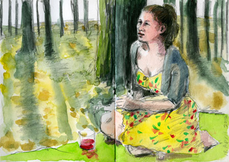
To celebrate my birthday my husband took me out for a meal near where we used to live in North London. Green Lanes is a street full of Greek, Turkish and, more recently, Kurdish shops, butchers, bakers and restaurants. You don't go to the cafés in Green Lanes for the decor (our one had synthetic wood panelling, lurid paintings, dismal lighting and an enormous water feature trickling and glowing greenly at one end). But in any of the numerous cafés and restaurants on this road you can get an enormous meal of delicious freshly prepared food for pretty much the price of a McDonalds meal. So we happily tucked into lahmacun, meze, salad and aubergine and lamb kebabs. Robin even managed to squeeze in some pudding while I sketched the couple at the next table and we drank our Turkish coffee. A great evening.
Monday, April 12, 2010
The best presents so often cost absolutely nothing
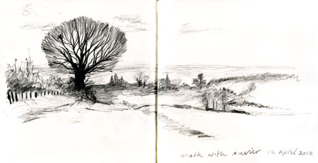
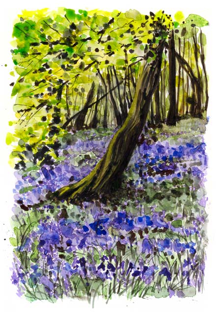
Another 12th of April and another year older. My darling daughter gave me the best ever present. She jumped out of bed at the crack of dawn and tidied the house. She vacuumed, mopped and generally did all the things I hate to do. Then I dragged Xavier off with me, after his father had told him that his present to me was to be my companion on a long walk around the woods and fields. We walked and talked and sketched and Rufus did his hippopotamus impersonation in the muddy puddles. A lovely day so far.
Sunday, April 11, 2010
French Market
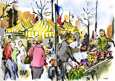
Most Saturdays I go into town to buy fruit and vegetables for my hungry family. It’s much cheaper than buying at the supermarket and it’s good to support the small traders. A few years ago the town council also permitted occasional visiting French and Italian markets to complement our normal market, which adds to the hustle and bustle of Saturdays in St Albans.
Friday, April 09, 2010
Tuesday, April 06, 2010
Hugo – again
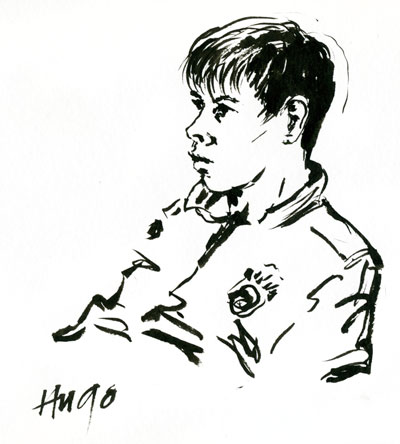
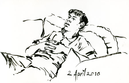
In this age when technology can enable the most incredible images, it seems like it’s only when there are imperfections in something that you can be sure it really is hand-made. Well that’s my justification for getting the first line for the back of the head so wrong. I also like the beautiful idea that Turkish carpet-makers have, that one should always include a deliberate error because only God can achieve perfection.
Monday, April 05, 2010
Sunday, April 04, 2010
Saturday, April 03, 2010
I wish I’d thought of this!
Jessica Hische creates a new initial drop capital letter every day. And you’re welcome to use them on your blog. What a brilliant idea! Visit http://dailydropcap.com to find any initial letters you’d like to use for the beautification of your blog. It doesn't really work on my blog because here the pictures come with borders, but if your blog has borderlesss pictures they look great.
Thursday, April 01, 2010
Vegemite or Marmite?
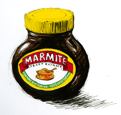
Having lived in the southern hemisphere as well as the north I’ve had the pleasure of eating both of these similar condiments. The strange thing is that once you’ve spread one of these on your toast for a few days, the other tastes blooming awful. So at the moment I’m in the marmite camp (and we do win hands down for cool packaging).

