
Wonderful geeky exchange
I received a delightful e-mail yesterday from a retired graphic designer. In fact he had held the very impressive post of Chief of the Typography Section for the US Government Printing Office. I was thrilled to read that he loved my new portfolio website which he said was ‘simple, clean and uses good typography’.
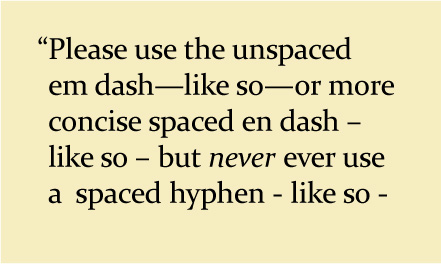
He did however question my use of ‘space en dash space’ rather than the use of an em dash. I’m sure many of you don’t know and don’t care about the fine details of typography and are experts in all kinds of much more important things. However isn't it wonderful that late at night on a Friday night—while hubby is watching a film I’ve seen before—the power of the internet allows me to discuss rareified topics that interest me with a stranger in another country. So William, if you're reading, isn’t the price of some of the horrors of the democratisation of typesetting nonetheless worth it for being able to enjoy these delightful moments of geekery?
posted by Julie Oakley at Saturday, January 23, 2010
![]()
![]()


5 Comments:
Priceless. This would have delighted me, too. I admit to a preference for the spaced en dash myself.
I think it is wonderful... I also think it is great that this sort of thing catches the interest of people who *aren't* experts; way back when me and the rest of our team of beancounters used to care only about the beancounting in our publications and leave others to worry about the design. Now I overhear people arguing about whether the brand has been applied intelligently!
Hope the portfolio leads to some wonderful new opportunities for you - with whatever form of dash or hyphen wherever it is right!
Hello Julie,
Oh those blessed m and n's that they talked about in editing class. I still don't bother about the correct one. I got into conversation with a member of our church (we usually talk fishing) at a funeral and he told me that he used to work as a typographer at the Herald, and other prominent papers. How different it is today with the way they set up the papers!
W.
I must admit to using the hyphen on the computer, mainly because I don't see a long dash like the em and en dash on my keyboard. And I will usually go for a lower case character if there's a choice,out of 8 parts laziness and 2 parts arthritis. But now that I know better, I would willingly make the effort if I knew where to find the em'n'en!
Yes I'm with you Hashi – though for print I reckon for some jobs I reckon the em dash can give the right traditional feel.
Richard, just so you know, I love working with beancounters - some of my nicest clients.
Wendy, doesn't matter on a blog, but I think you'd agree that proper quotation marks, dashes etc all contribute to beautiful typography.
Judith on the mac it's option-hyphen to type an en dash and option-shift-hyphen to type the em dash – maybe something similar on the PC.
Post a Comment
<< Home