
Waste not want not
My last business logo was an attempt to convey a very cool, minimalist corporate image, but y’know what I’m not a corporation. I’m an individual who runs a design business (whose number of employees and partners can fluctuate according to the economic climate). I also have come in contact with some delightful new clients through my personal blog. And there’s a very blurry line between the work I do for myself for pleasure and the work I do to earn money to pay the bills. So I thought it was time to chuck out the old logo and have a new one that better reflected the overlap between the personal and the business. Having been through this exercise more than once before, I know that for a designer, designing one’s own logo can put one into a state of paralysing indecision. It’s much easier to design for someone else. So to avoid dithering, what better than to tweak the existing sketchblog masthead.
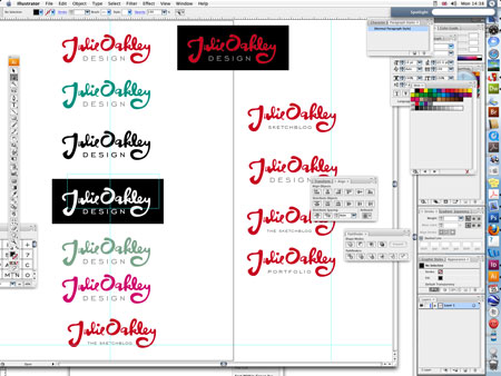
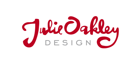
I decided that I would use the ‘Julie Oakley’ and underline it with the word ‘design’ as my business name is ‘Julie Oakley Design’. I took time to find the right typeface to go with the hand lettering. After trials with several different faces the typeface I chose was Engravers’ Gothic, because an extended typeface with a nice clean look worked best. I spent some time tweaking the letter shapes in the hand-drawn lettering so that they framed the word ‘design’. I also spent a great deal of time adjusting the typeset lettering to get the balance between all of the elements right whilst maintaining legibility at a very small size. I tweaked the Engravers’ Gothic to make it a tad lighter than how it comes out of the box. I made sure that the shapes reduced down well to a tiny size. I checked that it worked in black only and white reversed out. I tried out a few different colour schemes (though in the end I still thought that red did the business better). Once I was happy with the design logo, it made sense to use a variation on it for the sketchblog. In this instance legibility at a tiny size was not a concern because this version of the logo would only ever be used here at this kind of size. So I could afford to have the word ‘sketchblog’ at a much smaller size.
So there you go that’s my logo—until I get sick of it and decide that the only logo I can live with will be my company name, unadorned and set in Helvetica.
posted by Julie Oakley at Monday, January 25, 2010
![]()
![]()


0 Comments:
Post a Comment
<< Home