Tom and my regular rant about black backgrounds

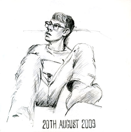
Taking a quick break from the Greek sketches, a drawing of Tom last night.
I read something this morning that interested me. Smashing magazine conducted a survey of typographic design patterns on 50 popular websites where typography matters more than usual (popular newspapers, magazines and blogs as well as various typography-related websites). As a blogger with many blogging friends using out-of-the-box templates like me, I just want to highlight one of their findings. How many of these typography-oriented websites had a dark background? Not a single one. I’ve ranted quite often about how I find it very unpleasant trying to read black background blogs and how they’d have to be something very special for me to visit them more than once. However, if you do have a dark background to your blog, rather than shaking your heads at the ranting of someone who obviously isn’t a web designer, why not take note of the example of web typographers at the top of their profession, who clearly believe that for maximum legibility a dark background is a no-no. Every one of the 50 beautifully designed sites in the survey had a white background.


3 Comments:
:>D
I've always liked dark backgrounds! and they make the colours in paintings sing. So I'll risk those who won't read my blog because of it ;>)
Vivien I think the pictures on your Watermarks blog look wonderful with a white background. Not in the least bit diminished compared to the images on your own blog.
I have seen photography blogs without any writing with black backgrounds look OK. I've seen photography blogs without any writing with a dark grey background look much better (than with a harsh black background). Most painters/illustrators don't however use the very saturated palette of photographers.
I'd never mount any of my pictures with a deep black mount although with some paintings I might consider a thin black frame.
However the point I'm making is about reading text. I view blogs because I like the interplay between image and text. Both are of interest to me so if I find it painful to read the text I find it difficult to persist.
I am absolutely with you on this Julie, and it's good to know it's not just a question of age related weakening eyesight. There have been several blogs of friends I have wanted to stay with, but couldn't.
I've recently become aware of the work of the World Wide Web Consortium in developing standards for web design, including accessibility for those with disabilities of various kinds. The professional website designers my organisation approached recently made a point of their work conforming to these standards, and I will bet black backgrounds are not favoured.
Post a Comment
<< Home