Recycle your old pictures
I had the usual designer's dilemma of how to pick one image to represent me at the top of my blog. Do I go minimalist or decorative? Do I choose this typeface or that? Do I choose this colour scheme or that? Anyway I've resolved it by deciding to have regular seasonal (or even - if I'm up to it - monthly) changes to my masthead.
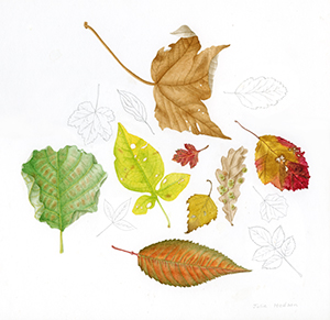
So now we kick off with my autumn masthead. The typeface is Trajan and the illustration has been taken from a water-colour illustration I did for a book of the natural history around my art college buildings.

So now we kick off with my autumn masthead. The typeface is Trajan and the illustration has been taken from a water-colour illustration I did for a book of the natural history around my art college buildings.


15 Comments:
Julie, this is really perfect! I've been trying to find a good linework thing for my Laurelines banner,too, so I doubly appreciate both your process and the end product. Well done!
Sooo beautiful! Fantastic! And so inspiring!
julie! you have made it! they are so lovely and in time for autumn.
i hope you can give me some tips about it because you i was not able to do mine the first time. i was the only one seeing my banner LOL! did you use jpeg or gif for your pictures?
Julie - really really impressive. It all comes together beautifully, the typeface is elegant and matches the painting perfectly.
Detlef
http://www.detlefjumpertz.com
Thank you all so much for your lovely comments.
isay, I'm no expert at HTML and I was very cautious. I copied and pasted the HTML into a word document at every stage before making any changes to the template so I could always revert back if there were any disasters and I also previewed every time before saving changes and republishing. I'm afraid I can't remember all of the stages as there was a great deal of trial and error.
I followed the same blog you followed for putting in the masthead (http://eyeswideapart.blogspot.com/). There was one error in her text where she'd put a 'www' in a blogspot address and as you know there isn't a 'www' in the blogger addresses.
Also there were no instructions for getting rid of the border so that was my bit of trial and error which eventually worked - although there's still a stray bit of border below the masthead which at the moment I don't mind but I may want to get rid of that in the future.
I think that if you could see your own picture but no-one else could, then maybe your link was to a picture that was on your computer rather than out there on the internet. My masthead was created at exactly the right size and then uploaded to some of my own space. If you don't have your own web space you could try using flickr. I would try creating a graphic at exactly the right size then upload to flickr. Provided that Flickr doesn't think its too big (and re-sizes it) the largest size picture will be the one that's the correct size.
This picture (because it's tonal ) was saved as a jpeg, but if I had a flatter, more graphic image it would probably look better saved as a gif.
Another helpful link was
http://www.bloggertalk.com/showthread.php?p=5174#post5174
Sorry I wasn't methodical enough to note exactly what I did.
julie i tried flickr, how would you like to help me and take a look if you can see my banner, please?
I'm really glad you chose to do an autum theme because I've been trying to create a similar themed layout but I just couldn't pull it off! Your banner is beautiful. I'm loving the water color illustration and all the art on your site! ;)
i really appreciate your help. thanks a lot. have a nice day!
Love the new header! Helps make me bear losing summer :-)
These are beautiful!! I can't wait for fall to get here!!!
These are SO BEAUTIFUL.I'm totally inspired to do some nature drawing now. Thanks for stopping by my website..I'll be back to visit yours!
Julie,
These leaves are just incredible adn so real I could pick them off the page.
Thank you for the visit and warm comments too!
I really love your masthead. I love fall anyway and these leaves are really beautiful. So are you intending to change it with the seasons?
Your artwork is fabulous! I especially like the leaves in the header (if I could do that I wouldn't change it!) and the 'depth' drawing (what a lovely memory it will make).
I like the new blog template (Maybe you've had it for awhile now?) I also want to do a banner but the tutorials I've read are for a different templete. I just have to sit down and sift through all that code...
Post a Comment
<< Home