Illustration Friday - FRESH and BCF9

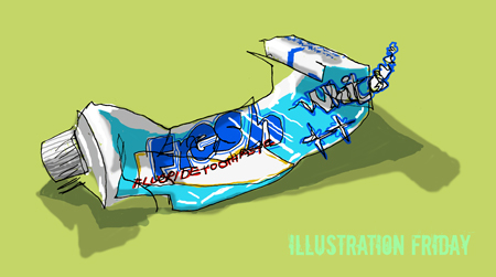
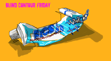
To me, the ultimate evocation of the word ‘fresh’ is the opening scene of the film ‘The Sound of Music’. The green hills, and the voice of Julie Andrews — like a cool mountain stream pouring over you. However my humble little effort — which is having to work its socks off for both Illustration Friday and Blind Contour Friday — will have to do.
Have a look at my son’s drawing I think it's great


22 Comments:
I think it's terrific Julie! - Works great for both. I'm impressed you drew it "blind"!!
Nice work and nice color choices!
Now if I can just combine Illustration Friday, Blind Contour Friday and EDM drawings.... hmmm!
Super work, Julie. The colours are intense and fab - however I like the dual, subtle shadow work best of all.
Detlef
http://www.detlefjumpertz.com
No image as fresh as a blind contour drawing! The top one IS freshest, and can taste the mint and see the way I do when brushing my teeth in the morning!
That's an excellent blind contour! I like how the whole vibe of the illustration changes with the background color...good job:>
These are excellent Julie. I love the contrast in the complimentary colors in the second one.
bee n me, I have to confess that the added colour wasn't 'blind' but everyone participating in blind contour seems to be looking at their mess of a drawing and trying to decide what to do with it before inflicting it on everyone.
Thermion - I tried, I tried but I couldn't find an EDM category that it came under
Detlef and michelle, t he double shadow was due to both my anglepoise and the main lighting being on and for once I tried to exaggerate rather than ignore that.
Anonymous - i agree tht's why I made that one the IF one
Carla and Toni - I couldn't choose between the background colours which is why I put up both
oh and thanks for visiting and commenting
Julie,
Nice work, I really love this for Blind Contour Friday and for "fresh". The golden background makes the tube really pop however I like the bright lime green, definitely represents "fresh" much better.
Nothing like fresh breath! These are so lively and bright. I love the green background.
this is great! I had already been to your son's site. of course I had no idea he was your son til I just read your comments. the blind contour aspect makes it so much more interesting than a realistic picture of a toothpaste tube.
Terrific take on the topic... and the "blind" drawings are astonishing... is it safe to assume you added the color and shading later?!!
Very nice! I'm going to check out your other posts now. :)
This is nice! Great addition of colour, i don't think it matters if the colour isn't blind, it's the actual lines that matter, and this is really good.
I love this! I really like how the lettering came out. I think I might have a go at bcf and see what happens. Very inspiring!
incredible! It works so well for illo-friday too.
I love everthing about it, espeically the type.
this just may be Niff's favorite of the week, but your son is making it hard for you. =)
Fab - like the top one best - that tube really does look like it's wiggling about :)
Great job. I'd like to see it without the color too
I love when bc type seems to float away, in this one the subject changes that a bit, looks like there's a hole in the tube and it's being squeezed out! beautiful color combinations
Wow, thank you for all your nice comments. And yes only the lines are blind contour, the colour isn't - which is why Karen you really do NOT want to see it without the colour!
Yeah, I really would ... cause that's what BC is all about, right? And I'll bet the meandering line would be cool to see!
I think this came out well and I love love love the color. Adds so much pizzazz and life!
Post a Comment
<< Home