Last night’s TV
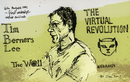 I really enjoyed the BBC TV programme ‘The Virtual Revolution’ last night. At the time my husband was seeing if he had successfully bid on a toy on e-Bay. My daughter was on facebook (and very annoyed that I’d commented on one of her photos—so I won’t do that again). My eldest son was listening to music he’d downloaded from the internet and my next son was catching up with revision using the BBC bitesize website. So, the whole family a testament to the internet revolution.
Meanwhile my father is living in luddite ignorance. I feel for him. He left it too late. He really thinks that getting on-line is an insurmountably difficult thing to master. I have taken him by the hand and led him through the process innumerable times. And at first he’s absolutely fine – in fact he thinks it’s fascinating as he looks at websites form his former homes of Uganda, Fiji and Hong Kong. And I say to him ‘you must do this every day or you’ll forget’ and he does for 2 or 3 days and then he loses interest. And then I get a call a month later asking me how he’s supposed to get on the internet or send an email. And despite him having a completely different computer set-up to mine I try to help him over the phone—then after half an hour of giving up my time to help him, he loses patience half-way through the exercise and gives up. Almost every time I go through this exercise I show my father Judith’s wonderful blog ‘Not Dead Yet’, in the hope that she will inspire him to persist at it.
Family graphics

I discovered this old graphic while sorting some old work out. I was getting an odd-shaped job printed and I was able use the left over card to have some blank greetings cards made. I stuck this logo on the back (for Amy—also known as Flo, Tom and Hugo Oakley) so that the children would be able to make their own greetings cards. Of course in those days I thought my family was complete—little did I know…
Spot illustrations
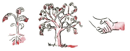
I’m hoping a little of what there is on the right will lead to what there is on the left of the picture for me. These, together with the previous illustration are a few spots from probably about a hundred I created for a series of business books where we had the budget for 4 colour covers and 2 colour text pages. These little pictures added a light touch to what could be, at times, fairly dry subject matter.
Busy, busy
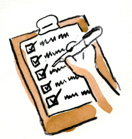 I’m a list sort of person. However as I never manage to tick off everything, I sometimes just write a list at the end of the day of all the things I did achieve. As I don’t have a boss to pat me on the back, for a job well done, someone’s gotta do it.
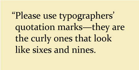
Number 2: Typographic admonition series
Xavier entranced
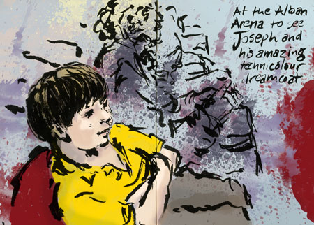
Our dear friend Natalie gave us free tickets for ‘Joseph and his Amazing Technicolour Dreamcoat’. We took Xavier and Auntie Di and they both had a wonderful time. I loved it that they loved it, and it was really great to have a family night out. The music was the usual Lloyd Weber stuff – I can take it or leave it, but the highlights for me were the Elvis Presley impersonations (there can never be too many Elvis Presley impersonators for me) and when Joseph came out at the end looking like Eddie Izzard in a gold ballgown. What was the costume designer thinking?
Waste not want not
My last business logo was an attempt to convey a very cool, minimalist corporate image, but y’know what I’m not a corporation. I’m an individual who runs a design business (whose number of employees and partners can fluctuate according to the economic climate). I also have come in contact with some delightful new clients through my personal blog. And there’s a very blurry line between the work I do for myself for pleasure and the work I do to earn money to pay the bills. So I thought it was time to chuck out the old logo and have a new one that better reflected the overlap between the personal and the business. Having been through this exercise more than once before, I know that for a designer, designing one’s own logo can put one into a state of paralysing indecision. It’s much easier to design for someone else. So to avoid dithering, what better than to tweak the existing sketchblog masthead.
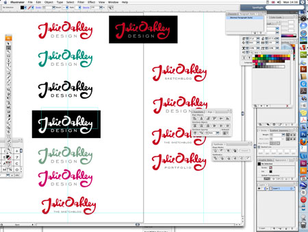
I decided that I would use the ‘Julie Oakley’ and underline it with the word ‘design’ as my business name is ‘Julie Oakley Design’. I took time to find the right typeface to go with the hand lettering. After trials with several different faces the typeface I chose was Engravers’ Gothic, because an extended typeface with a nice clean look worked best. I spent some time tweaking the letter shapes in the hand-drawn lettering so that they framed the word ‘design’. I also spent a great deal of time adjusting the typeset lettering to get the balance between all of the elements right whilst maintaining legibility at a very small size. I tweaked the Engravers’ Gothic to make it a tad lighter than how it comes out of the box. I made sure that the shapes reduced down well to a tiny size. I checked that it worked in black only and white reversed out. I tried out a few different colour schemes (though in the end I still thought that red did the business better). Once I was happy with the design logo, it made sense to use a variation on it for the sketchblog. In this instance legibility at a tiny size was not a concern because this version of the logo would only ever be used here at this kind of size. So I could afford to have the word ‘sketchblog’ at a much smaller size.

So there you go that’s my logo—until I get sick of it and decide that the only logo I can live with will be my company name, unadorned and set in Helvetica.
Wonderful geeky exchange
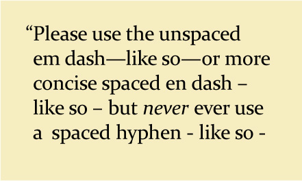
I received a delightful e-mail yesterday from a retired graphic designer. In fact he had held the very impressive post of Chief of the Typography Section for the US Government Printing Office. I was thrilled to read that he loved my new portfolio website which he said was ‘simple, clean and uses good typography’.
He did however question my use of ‘space en dash space’ rather than the use of an em dash. I’m sure many of you don’t know and don’t care about the fine details of typography and are experts in all kinds of much more important things. However isn't it wonderful that late at night on a Friday night—while hubby is watching a film I’ve seen before—the power of the internet allows me to discuss rareified topics that interest me with a stranger in another country. So William, if you're reading, isn’t the price of some of the horrors of the democratisation of typesetting nonetheless worth it for being able to enjoy these delightful moments of geekery?
Beech class assembly
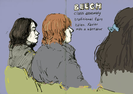 A quickie of some of the mothers while waiting for another school assembly. Those little kids, they break your heart.
My new portfolio website
At last it’s done.
Now for those of you that know me, I’m going to let you in on a secret. I had some miserable news before Christmas. One of my most important clients (a small part of a much larger organisation), who I’ve had a fantastic working relationship with over 16 years, had to end our working relationship.
No, they were not unhappy with my work – they’d been happy to stick with me for over 16 years, and gosh I was grateful to have such a long working relationship with them. It was simply that with a major re-branding exercise of the larger organisation, the marketing department of the umbrella organisation decided it made sense for all of their publications to be designed by one big design company.
So suddenly my lovely bread and butter job has disappeared, and I’ve got to fill the gap. So if any of you – my lovely readers – know of any organisation that is looking for a good designer, please will you point them in the direction of my portfolio website here. My forté is producing newsletters, magazines and long text documents, because as well as being a good all round print-designer, I am pretty damn good at proof-reading and sub-editing.
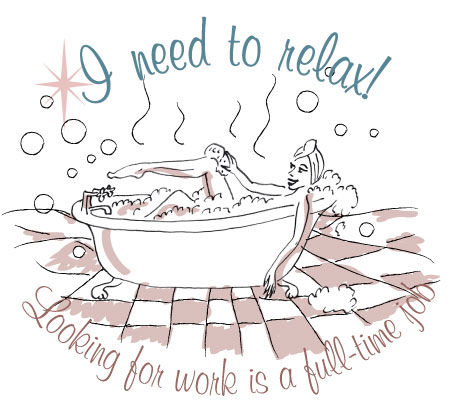
Magazine illustration
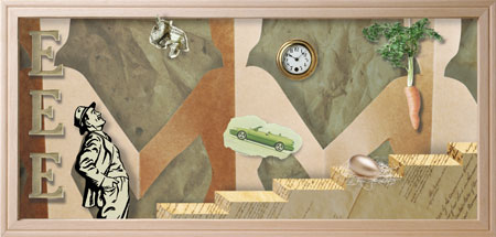
Still busy with the website and as this didn’t make the cut for the portfolio part of it – and I don’t have time to sketch – an old illustration will have to do. Can’t remember what on earth it was about – how to incentivise staff maybe?
Thank goodness the snow has melted
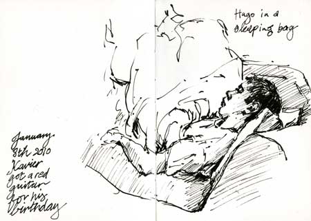
Hugo, last week, inside a sleeping bag. I like the snow to enchant us for a day or two and then disappear. This just went on for too blooming long.
Too tired to blog
One of my regular visits, Ros Stendhal, wrote a post today where she said you’re never too tired to journal. Hmmm… after a day of battling with a web design that won’t work, I’m not sure that I can concur with that. However in the spirit of at least having a go I’ve made myself write a few lines before collapsing in my bed.
Another link that may interest you, the Grandaddy of bloggers, Samuel Pepys is available to be read here. I see that today in 1659 despite being “exceedingly disturbed in the night with the barking of a dog of one of our neighbours that I could not sleep for an hour or two” he still managed a diary entry – and he also had the snow and the cold that we’re having.
Flo on Xavier’s birthday
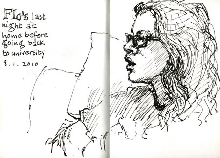
Still struggling with the website. And I’m thinking about Flo and Tom because they have important exams tomorrow.
Sneak preview
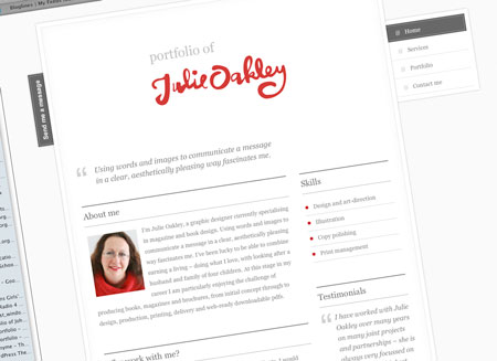 Been busy working on my portfolio website. It’s such a long time since I designed a website there’s a hell of a lot to learn. It’s blood, sweat and tears to produce something that looks effortlessly simple.
Last drawing of 2009
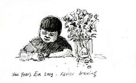
For both Xavier and me.